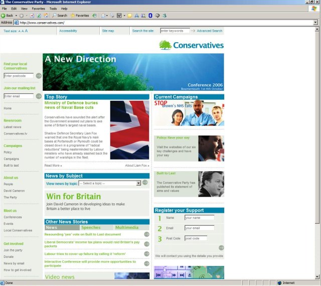
 OK, what colour blind designer is in charge of the offcial Conservative Party website? Seriously, it's rubbish. I realise that might sound a little blunt but choosing a putrid green colour for the links when the colour used in the text of the logo makes the entire site clash. It's made especially worse by the addition of a bit of blue text here and a bit of grey text there. It looks more like green for green's sake than anything else. (click image for larger version)
Wednesday, September 20, 2006
It hurts my eyes!
OK, what colour blind designer is in charge of the offcial Conservative Party website? Seriously, it's rubbish. I realise that might sound a little blunt but choosing a putrid green colour for the links when the colour used in the text of the logo makes the entire site clash. It's made especially worse by the addition of a bit of blue text here and a bit of grey text there. It looks more like green for green's sake than anything else. (click image for larger version)
Subscribe to:
Post Comments (Atom)
6 comments:
When I was at primary school, an older girl once ate a load of lime blamange and was sick on me.
The links are the exact same colour as that.
Eugh, revolting!
Ouch. In some areas green text is link, in others it's header text, in others it's something else again.
The site looks pretty, but the navigation isn't clear due to inconsistency in link styling &c. I mean, I have no sense of colour coordination, so I stick to greyscale for personal stuff and pay a designer for work stuff.
They've paid a designer and got that. My guy at work is so undervalued. Still, at least they have released a style guide for the logo.
Regardless, the website looks better than the other two parties sites. The LibDem site got a makeover recently, and they dragged it into the 1990s...
Bloody hell, that's revolting. Not just the design... I mean it's full of bloody Tories.
out damned spot?
It was all done by perfectday.gb.com - as was all the Cameron Campaign stuff, and the original Cameron's Conservative light blue makeover, and the Built to Last document design and the new £40,000 oak tree logo. Someone at that company has been doing very nicely for not particularly inspiring or brilliant work.
Post a Comment